Turning a generic Bootstrap dashboard into a scalable brand-native system
TADE GO is an official partner of Yandex Go, operating in Belarus, Georgia, and Turkey, providing couriers and taxi drivers with a dashboard to track performance, payouts, and delivery activity.
%20(1).jpg)
Role
Product Designer
Scope
UX/UI design
Design System
Motion
Tools
Figma
Jitter
Year
2025
/* Problem */
The existing dashboard relied on DashLite, a generic Bootstrap-based admin template, with no underlying design system. This led to inconsistent patterns, uncontrolled variations, and unclear behavior across the interface.
Components lacked defined roles, so similar actions looked and behaved differently across the product. No design system existed outside of code, leaving the team without a shared reference for design and development. Each update required manual fixes because there was no reusable foundation.
For users, this made key workflows harder to understand and often led them to contact support for guidance.
/* Solution */
I defined clear roles for components, reduced unnecessary variation, and made them reusable across the product. This created a system that holds across languages and layouts, with predictable behavior regardless of content.
The visual layer was aligned with the brand through consistent rules. Light and dark modes were built into the system using semantic tokens, allowing themes to switch without duplicating components.
This gave design and development a shared foundation that made the interface consistent by default and easier to maintain and extend.
.jpg)
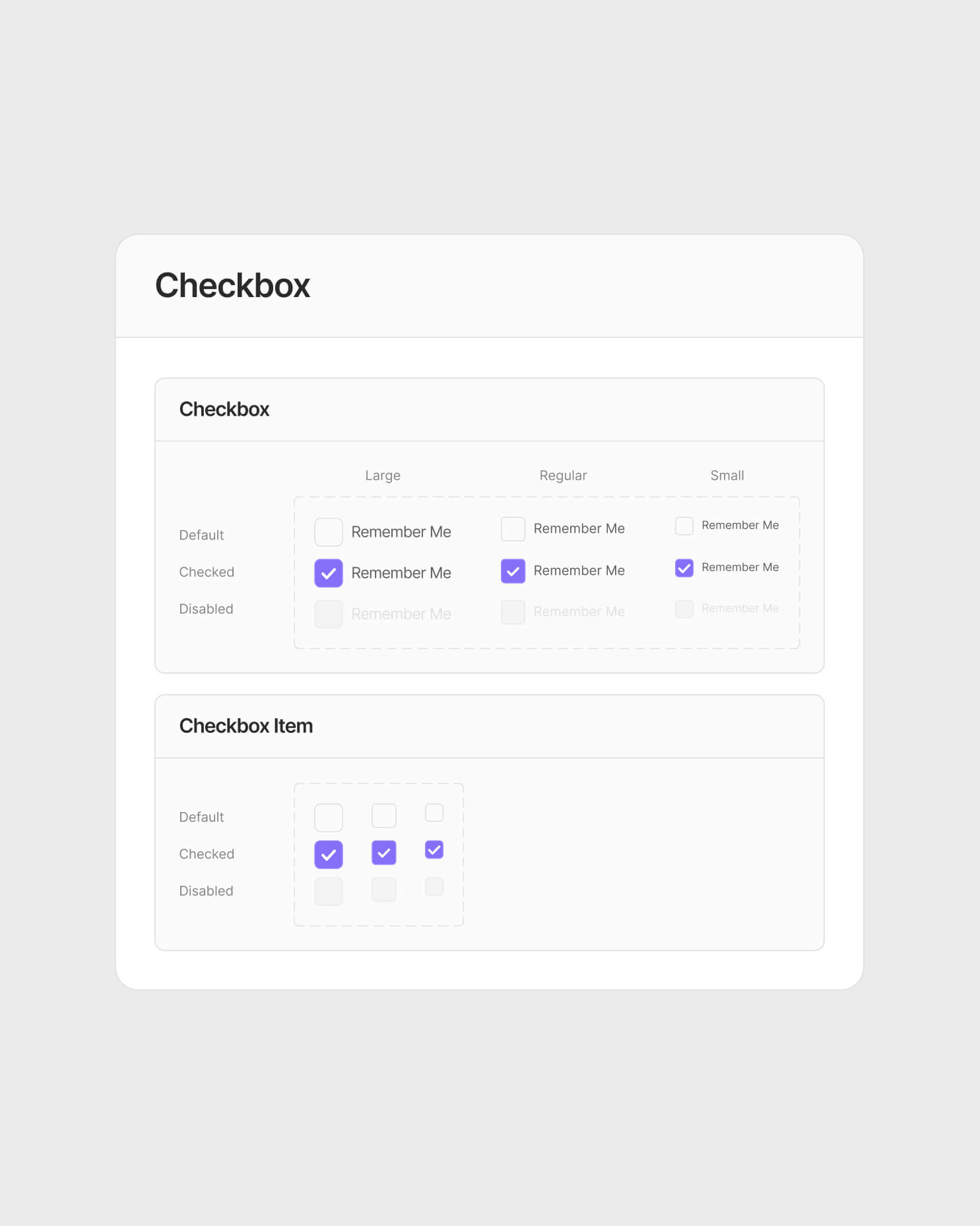
New system
The system covers color tokens, typography, spacing, and core UI components - all documented in Figma and built to work within Bootstrap's existing architecture.
Every component has a defined role, a light and dark variant, and behaves consistently across English, Russian, and Turkish layouts.


%20(1).jpg)
Dark mode
Survey data from the client’s users showed a strong preference for dark mode.
Using Figma variables, I defined semantic color roles that could switch at the token level without duplicating components. This ensured visual consistency and predictable component behavior across both themes.
.jpg)
%20(1).jpg)
Motion
Motion was used selectively to strengthen brand recognition and add a more human layer to the product. The animated login screen turned a high-frequency touchpoint into a clear brand moment, while the birthday greeting introduced lightweight personalization without interfering with core workflows.
Project outcome
I created a shared component system for the dashboard, defining clear roles, states, and interaction patterns across recurring workflows. This gave design and development a shared reference and made the experience more consistent across markets and languages.
Reduced support call volume by 21%
Standardized key workflows across 3 markets and 3 languages
Reduced manual interface fixes through reusable components
This is just a snapshot of the entire design process
Reach out to e.astapable@gmail.com for the full story
Email Me